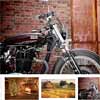
Eagle Gallery this is modern gallery with image zoom functionality. To manage the gallery you can use gestures or control buttons. This is a fully responsive gallery which has support touch screen and was created for mobile devices, laptops and desktops. With this gallery you can easily create a product gallery on your internet shop for detailed view and customize it with help of options
Best jQuery Responsive Plugins & Tutorials with Demo
Gridlex : Flexbox Grid System
A responsive flexbox based grid system to help you making a responsive website based upon css3 flexbox.
- Basically each column is the same width as every other cell in the grid.
- But you can add sizing classes to individual columns.
- For responsive designs, you can add classes based on media-queries.
- Top, bottom, or middle. For the grid. And for the columns.
- Grids can be nested. Always. Directly in a column.

jQuery Responsive Tables

A lightweight jQuery plugin that allows table markup to become fully responsive. It provides a clean list view via devices with small screens. It can work for multiple tables on a single page, as well as with tables that contain various combinations of merged cells. Best of all, it uses pure CSS for the rendering.
Multi-Level Menu with CSS3 & JavaScript
A simple multi-level menu with delayed item animations and an optional breadcrumb navigation and back button.
The idea is to animate each menu item once a level is changed. The animation starts with the item clicked and the delays are propagated through the neighbors. The animation delays follow the same logic for the incoming items of the new level of the multi-level menu. As optional elements we have a breadcrumb navigation and a back button (not shown in our demo). Deeper levels are referenced with a data attribute
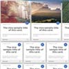
CSS-Gallery : Data-bound Photo Gallery in pure CSS

An interactive, data-bound photo gallery in pure CSS.CSS-Gallery demonstrates the true power of CSS and LESS. This is a fully interactive photo gallery, built entirely in CSS and LESS, with no Javascript anywhere.
- Use the hamburger menu to filter photos by category
- Use the view icons on the upper right to switch between thumbnail and list views
- Click a photo to open a scaled lightbox showing a larger view
- Click the arrows on the sides of the lightbox to switch photos directly.
Ideal Image Slider
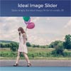
The aim behind the Ideal Image Slider is to create a slider which has just the right amount of features, with no bloat and be easy to extend so that more features can be added as “extensions”. Here are the ideals and core features I wanted to include:
- HTML5 (SEO optimised)
- CSS3 transitions (a few simple transitions like slide/fade)
- Left/Right navigation (including touch/swipe support)
- Responsive
- HiDPI (retina) support
- ARIA support
- Extremely simple to setup (no dependencies)
- Very extensible
- Uses progressive enhancement
SOLID : CSS3 Responsive Tabs
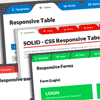
Fed up with the old tab designs that you have?
Have your website a totally tab-licious makeover with this distinctive and eye catching tab designs.
- 8 Tab Designs
- Flexible Designs
- Fully Responsive including its contents
- Includes Typographical Elements (Headings, Text Callout, Blockquote)
- Includes Responsive Tables
- Includes Responsive Bar Chart
- Includes Responsive Column Chart
- Includes Responsive Video


