Best jQuery Responsive Plugins & Tutorials with Demo

    Zuper Responsive Multitouch Slider in jQuery

    Zuper Responsive Multitouch Slider in jQuery

    Zuper Slider uses unobtrusive javascript and a powerful configuration panel for effects and design elements to transform a block of simple HTML markup into a beautiful elegant slider. When we create the Zuper Slider is lightweight, fast loading, mobile ready, responsive, easy to use,has multiple skins and much more. Zuper Slider is the most complex and powerful slider that you can use. Saves development time – Powerful features – Simple implementation – Fully customizable.

    Mobile Ready Zuperslider is mobile ready. Touch gestures navigation for iOS, Android and other touch devices. Its main feature is that has the touch technology implemented for mobile devices.

    SelectNav.js :Responsive Drop-Down menu in JavaScript

    SelectNav.js :Responsive Drop-Down menu in JavaScript

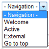
    SelectNav.js is a JavaScript plugin that lets you convert your website navigation into a select drop-down menu. Used together with media queries it helps you to create a space saving, responsive navigation for small screen devices.SelectNav.js adds a js class to the html element. Thanks to this, when JavaScript is disabled the default navigation will be visible. Selectnav.js works with every navigation in form of ul or ol lists that follow the example above.

    Mobile Navigation Design & Tutorial with jQuery

    Mobile Navigation Design & Tutorial with jQuery

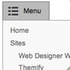
    One of the common challenges when designing responsive design for mobile is the navigation menu. If the site has many sections or pages, it gets challenging to squeeze all the items into a small mobile resolution. The navigation most likely ends up running into multiple lines or the buttons stacking on top each other. So I’m going to review some of the design solution and provide a quick tutorial on how to create a mobile navigation with jQuery.

    Respond.js : Fast CSS3 Media Queries for Internet Explorer 6-8

    Respond.js : Fast CSS3 Media Queries for Internet Explorer 6-8

    A fast & lightweight polyfill for min/max-width CSS3 Media Queries (for IE 6-8, and more).The goal of this script is to provide a fast and lightweight (3kb minified / 1kb gzipped) script to enable responsive web designs in browsers that don’t support CSS3 Media Queries – in particular, Internet Explorer 8 and under. It’s written in such a way that it will probably patch support for other non-supporting browsers as well (more information on that soon).

    rwdImageMaps : Responsive Image Maps jQuery Plugin

    rwdImageMaps : Responsive Image Maps jQuery Plugin

    rwdImageMaps is a jQuery plugin for creating Responsive Image Maps. It allows image maps to be used in a responsive design by recalculating the area coordinates to match the actual image size on load and window.resize.

    Flare Responsive Mobile-Optimized Lightbox Plugin in jQuery

    Flare Responsive Mobile-Optimized Lightbox Plugin in jQuery

    Flare – a custom responsive, touch enabled, mobile optimized lightbox jQuery plugin, which can be used to display single images/videos or entire galleries.

    Image/Video Navigation via:

    • UI buttons
    • Swipe gestures
    • Mousewheel navigation
    • Keyboard arrows

    Transitions:

    • Use hardware acceleratation on CSS transforms
    • Fallbacks to standard jquery animation in older browers

    Media Support:

    • Images
    • Fullscreen Video (YouTube, Vimeo, Vid.ly and local Video)
    • Automatically retrieves cover image for YouTube, Vimeo and Vid.ly videos

    jQuery Experimental page layout inspider by Flipboard

    jQuery Experimental page layout inspider by Flipboard

    Today we want to share an experimental 3D layout with you. It’s inspired by the famous Flipboard app where a seamlessly “normal” page flips like a page in a book when swiped. We’ve tried to re-create that effect using CSS 3D transforms and JavaScript, making a layout that is “flippable” and responsive. While the swiping makes sense for touch devices, dragging will do for normal browsers.

    breakpoints : Trigger jQuery events for your responsive design

    breakpoints : Trigger jQuery events for your responsive design

    Trigger jQuery events for your responsive design breakpoints!.Define breakpoints for your responsive design, and Breakpoints.js will fire custom events when the browser enters and/or exits that breakpoint.

    TouchTouch – A jQuery Touch Optimized Gallery Plugin with Demo

    TouchTouch – A jQuery Touch Optimized Gallery Plugin with Demo

    I want to share a little experiment with our readers – TouchTouch. It is a jQuery plugin that turns a collection of photos on a webpage into a touch-friendly mobile gallery. It works on all major browsers (except for IE7 and below) and most importantly is specifically designed with iOS and Android in mind.
    Highlights

    • Smooth CSS3 animations and transitions;
    • A responsive CSS interface that fills the screen and responds to changes in device orientation;
    • Preloads photos only when they are needed;
    • Supports swiping through photos;
    • Displays onscreen arrows and listens for arrow key presses on desktop browsers;

    Wookmark : jQuery Grid Layout plugin with Demo

    Wookmark : jQuery Grid Layout plugin with Demo

    Wookmark is a free jQuery plugin for creating dynamic and multi column layouts.

    This jQuery plugin dynamically creates boxes with random heights, it detects the size of the window and automatically organizes the boxes into columns approximately of equal height.