
xSquare is a responsive jQuery image slider. It has a layout that consists of grids making it useful for variety of web page positions. Though the main purpose of the image slider is within a banner position it can easily be implemented as an image gallery or something similar because it is compatible with lightbox, prettyPhoto etc. The loading of images is done via smart lazyLoad with an implemented loader. Effective sliding transitions make the slider have a more dynamic look. The xSquare responsive image slider gives you the option to place up to 7 images in one slide or to place one effectively sliced photo.
Best jQuery Responsive Plugins & Tutorials with Demo
FrameIt : Responsive jQuery Plugin

FrameIt is a Responsive jQuery plugin for frame images.Objective of the plugin is to create a plugin that works on mobile devices, smartphones and desktop without loss functionality. This plugin is “responsive”, which means it’s 100% compatible with responsive web designs.
Features:
- Responsive and mobile Ready
- Support for all majors browser
- Fully customizable frames shapes with css classes
- Fully configurable animation of the frames
- Separate images for each frame
- Anchor frames. Follows any link you want
- +20 presets for all images orientations
- CSS3 Real Shadow Effects
- CSS3 responsive background images (even on unsupported browser)

jQuery Responsive & Multi-Level Navigation
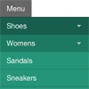
If you’ve ever worked on a responsive website, you’ve no doubt had to tackle one of the trickiest problems in this emerging field: navigation. For simple navigation, the solutions can be straight-forward. However, if you’re working on something a bit more complex, maybe with multiple nested lists and dropdowns, a more dramatic rearrangement may be in order.
In this approach to responsive navigation, we’re going to use an approach that can accommodate large, multi-level navigation menus using media queries and jQuery, whilst trying to keep our markup simple and our external resources minimal.
JackBox : jQuery Responsive Lightbox

JackBox is a Responsive Lightbox with Real Social Sharing.
Features:
- Responsive / Mobile Ready
- Retina Ready Graphics
- Share any item through Twitter, Facebook, Pinterest and Google+
- Deep-linking, every item has it’s own unique link
- Touch Swipe for Mobile Devices
- Genuine Fullscreen for Firefox and Chrome
- Group any items together and create item categories
- Youtube Video w/ Mobile Fallback
- Vimeo Video w/ Mobile Fallback
- Automatic Youtube and Vimeo thumbnail loading
- HTML5 Video w/ Flash backup
- HTML5 Audio w/ Flash backup
- Flash Video w/ Mobile Backup
- Load HTML Divs, iFrames and Google Maps
- A boatload of Custom Thumbnail Hovers and Tooltips
- CSS3 Preloader for smoother animation
jQuery Responsive IFrames

IFrames are commonly used to allow embedding of third-party content. Many popular services, such as YouTube and Facebook, make extensive use of IFrames in their embeddable widgets.
On a responsive website, all page components must be responsive. There are multiple ways of making an IFrame responsive. Some responsive IFrame use-cases can be solved with simple Javascript and CSS. Our library targets a challenging use-case in which embedded content:
Can have unknown width and height
Can have unknown width/height ratio
Can change its width or height as users interact with dynamic content and we want the size of the IFrame to change accordingly to avoid scrollbars.
Making IFrames with such constraints is a challenging task. We developed this tiny (0.9KB minified and gzipped) jQuery plugin, at NPR, to make the task easier.
For simpler use-cases, e.g. targeting the embedding of fixed ratio video content, you may want to check-out: FitVid.js, instead.
Socialist : jQuery Social Media Feed Plugin

A jQuery Social Plugin to create a single social media stream from multiple social networks.Socialist is a jquery social plugin that creates a social stream (or social “wall”) from multiple social media feeds in one place. Use it to pull content from Facebook pages, Twitter, LinkedIn, YouTube and other social networks…
Features
- Uses AJAX to aggregate content from multiple sources
- Turns any DIV element into a social container
- Visually appealing responsive layouts, or simple list
- Supported numerous social and content sources — use it to visualize any “feed”

Responsive Measure: A jQuery plugin for responsive typography

Reading is one of the most basic things we do on the web. CSS gives us control over font-size and line-height but we don’t have a good way to control the measure. Until now.
Responsive Measure is a simple script that allows you to pass in a selector (ideally the container where your primary content will go) which generates the ideal font size needed to produce the ideal measure for your text.
jQuery Responsive Tabs & Accordion Plugin

Tabs + Accordion is a jQuery plugin that simplifies creating responsive tabs and accordions.
Features:
- You can use the same, simple HTML markup for both Tabs and Accordion.
- You don’t have to learn how to integrate and use two different products, which saves you time.
- It is lightweight, because the majority of underlying code for Tabs and Accordion is shared.
- You don’t have to paint yourself but you can. There is plenty of choice with the included themes.
- Folks visiting your website with a screenreader can use Tabs + Accordion pleasantly.
- And folks visiting your website with JavaScript disabled aren’t missing out on content inside Tabs + Accordion.


