
Gamma Gallery is an experimental responsive image gallery that attempts to provide an adjustable responsive images approach taking its grid layout and the full slideshow view into account.Gamma Gallery uses David David DeSandro’s Masonry in a fluid mode where column numbers are defined depending on the grid container sizes.
Best jQuery Responsive Plugins & Tutorials with Demo
BootMetro : Create web apps with Windows 8 Metro user interface
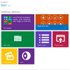
BootMetro provides simple and flexible HTML, CSS, and Javascript for web apps that wants to use the “Windows 8 MetroUI” style, without the need to run on Windows 8. It is built on top of Twitter Bootstrap and was originally inspired by the Metro UI CSS by Sergey Pimenov.
The framework permit to create web applications with the look&feel of the not-yet-released Windows 8 MetroUI style. Maybe not ideal for internet web sites, the MetroUI style can be adopted for modern intranet web sites. I’ve choosen to use as base the awesome Twitter Bootstrap framework, applying a set of customizations in pure css (but planning to do it in LESS for future version).
ShopSlider : jQuery Responsive Shop Slider with Tab

ShopSlider is a jQuery Responsive Shop Slider Plugin for commercial sites, online shops, stores. Works well on all screen sizes, auto detects and determines the best way to display items, support tabs and AJAX load.
Features:
- Smart Responsive Design
- Detect Screen Size and Determine the Best Way to Display Items.
- Support Multi Tabs
- Support Many Sliders in same page
- Touch Swipe / Click to Move Next/Prev
- Support AJAX and Inline Content
- Many Styles and Effects
- Control AutoPlay, Effect In, Effect Out with Duration and Delay Time …
Grid-A-Licious : A jQuery Responsive Grid Layout

I created a jQuery plugin. I named it Grid-A-Licious and described it as, “Divs are placed in chronological order with a special grid” because I had no clue how to explain it better.Today this floating grid layout effect is heavily used around the net and there are tons of different variations of the script to download and use. Some more popular than the other, but all does a better job than Grid-A-Licious.
jQuery Responsive Carousel Plugin

Carousel takes simple HTML- and CSS-only carousels and progressively enhances them with features such as page lists, scrolling, class-toggling, timers, timer offsets as well as touch and keyboard events. By following a basic HTML pattern and using some basic CSS, your carousels will also work, to a degree, without JavaScript enabled.

jQuery Responsive Tile Gallery

Responsive Tile Gallery is a completely responsive image gallery. It allows your visitors to easily sort and view all of your images. It also allows you to put your images into categories, load thumbnails instead of full resolution images, and develop a responsive websites for all platforms.
Features:
- Fully responsive image gallery
- Optional categories to let users sort through images
- Optional lightbox for full resolution viewing
- Optional Image captions
- Option to use thumbnail images for faster load times
- Uses CSS Transitions with jQuery fallbacks for improved performance
- Cross-browser compatible (from IE7 and up)
Responsive and Mobile-Friendly Tooltip

Tooltip is a splendid invention. Small detail in web design that plays a big role when it comes to user experience. Usually, tooltips are used to present a tiny amount of hidden content (mainly explanatory, so-called tips), that pops up when user moves a cursor over or clicks (less common) on a special target.When working on my personal website, I was in need of a tooltip. I decided not to limit it just on a typical definition of a tooltip, but also make it a better occurrence using CSS and jQuery technologies.
Key Features
- It’s responsive.
- It’s mobile-friendly.
- It’s HTML formatting capable.
Parallax Slider : Responsive jQuery Plugin

Parallax Effect – Full Collection of Sliders comes in 4 versions: Classic, Perpetuum Mobile, Mouse Interaction and Ultra. Each of these 4 versions has 2 skins (bullets & thumbs) and can be used as Fixed Dimensions or as Full Width. Please see the features and check the live preview of this slider and convince yourself of its quality.


