Best jQuery Responsive Plugins & Tutorials with Demo

    Creating a CSS3 Responsive Menu with jQuery

    Creating a CSS3 Responsive Menu with jQuery

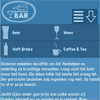
    This tutorial aims to provide step by step instructions to enable you to create a responsive navigation menu that adapts to varying screen sizes, with the help of CSS media queries.

    I adopted the Mobile First approach to designing the menu. In essence, this approach adopts a strategy of designing for mobile devices first, then working your way up to larger ones, such as desktop monitors. The base design is developed for the popular dimensions of mobile devices – 320 x 480. I then utilised media queries, primarily for scaling up to larger screen sizes, but also as an effective tool for enhancing the design.

    stacktable.js : jQuery plugin for Stacking Tables on small screens

    stacktable.js : jQuery plugin for Stacking Tables on small screens

    The jQuery plugin for equalizing the height or width of elements. The purpose of stacktable.js is to give you an easy way of converting wide tables to a format that will work better on small screens. It creates a copy of the table that is converted into a 2-column key/value format.Use media queries to toggle the visibility of the original table and the stacktable (check out the stacktable.css example).

    jQuery Responsive Horizontal Layout with CSS3

    jQuery Responsive Horizontal Layout with CSS3

    Today we want to show you how to create a horizontal layout in jQuery and CSS3 with several content panels. The idea is to make each panel individually scrollable and animate a content panel to the left of the viewport once it’s clicked or selected from the menu. The challenge is to deal with different viewport sizes meaning that we will change the layout if the screen is not wide enough in order to be stacked vertically instead of horizontally.

    jquery.fillwidth : Line up Images to the edge of their Container

    jquery.fillwidth : Line up Images to the edge of their Container

    A jQuery plugin that given a ul with images inside their lis will do some things to line them up so that everything fits inside their container nice and flush to the edges. Used throughout Art.sy to make rows of images fit inside a fluid container and still stay flush without cropping the images.

    OneMenu : jQuery Responsive Metro UI Menu

    OneMenu : jQuery Responsive Metro UI Menu

    OneMenu is a jQuery navigation menu plugin that is created for Metro UI themes. OneMenu supports responsive design, unlimited menus.

    Features:

    • Responsive Design for Metro Themes
    • Unlimited Menus.
    • Unlimited Items in OneMenu.
    • Works on Aalmost Platforms.
    • Auto align items in Dynamic Grid.
    • Light weight.
    • Easy Customiztion.

    Shapeshift : jQuery plugin for dynamic grids with drag and drop

    Shapeshift : jQuery plugin for dynamic grids with drag and drop

    ShapeShift is a jQuery plugin which helps you to create a dynamic grid system with awesome multi-column drag and drop functionality.This jQuery plugin will dynamically arrange a collection of elements into a grid in their parent container.Inspired heavily by the jQuery Masonry plugin.
    Another great feature is masonry installed so that when resizing ,the grid to accomodate for more or less space is automatically turned on in this jquery plugin, so if your parent container has a 100% grid resizing the window will shapeshift the child objects around to accomodate for the new layout.

    MelonHTML5 : jQuery Metro Gallery

    MelonHTML5 : jQuery Metro Gallery

    Metro Gallery a flexible and easy to integrate photo gallery featured in Metro Design. It allows you to build your unique photo wall with your custom settings.

    Features:

    • Unique Metro design
    • Mobile device ready (phones + tablets)
    • 21 different tile sizes
    • CSS3 animations + jQuery fallback for IE
    • Dynamic layout
    • 9 pre-defined themes
    • 3 loading animations
    • Black & White mode
    • Fully customizable

    App Folders : jQuery to create iOS-like App Folders on any website

    App Folders : jQuery to create iOS-like App Folders on any website

    Use jQuery to create iOS-like App Folders on any website. They can contain any content and be styled in any way.

    Features:

    • Works great on mobiles
    • Responsive design
    • Fully styleable (it’s easy!)
    • Well-documented
    • Very easy to use
    • Can contain any content (images, text, video, complex layouts)
    • Opened Folder can be linked to from other pages
    • Configurable position changes for nth folder

    Pin View : inspired by Pinterest in jQuery

    Pin View : inspired by Pinterest in jQuery

    This module creates a Pinterest like Pin Board view on your website. Users can attach pins on the pin board .Has only client side view and uses jQuery with Masonry plugin.

    Responsive Img : jQuery Responsive Image Plugin

    Responsive Img : jQuery Responsive Image Plugin

    This jQuery Plugin make your existing images responsive without creating new images.Responsive Img is a solution to all which combines a jQuery plugin with a PHP image pre-processor.The plugin enables the page to change the src attributes of the images in parallel to the container width and the PHP file auto-creates the new/resized images.

    Images are only created when requested for the first time and this process won’t be repeated for future requests to perform better.