Best jQuery Responsive Plugins & Tutorials with Demo

    Sky jQuery Touch Carousel

    Sky jQuery Touch Carousel

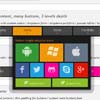
    Sky jQuery Touch Carousel is a jQuery carousel plugin with rich set of features. It is responsive, touch-enabled, fast and smooth. It can be easily integrated into your own web projects. You can customize the visual appearance of the plugin with the help of the plugin options and CSS.

    Features:

    • Supports touch devices. (iPad, iPhone, Android etc.)
    • Offers keyboard and mouse wheel support.
    • Supports multiple instances.
    • Auto slideshow and loop.
    • Hardware acceleration (Uses GPU for graphic intensive tasks)
    • Uses CSS3 transitions.
    • Has responsive layout.
    • Supports Internet Explorer 7-8.
    • Reflection and gradient overlay effects.

    jQuery-menu-aim : jQuery Responsive Mega dropdowns like Amazon’s

    jQuery-menu-aim : jQuery Responsive Mega dropdowns like Amazon's

    menu-aim is a jQuery plugin for dropdown menus that can differentiate between a user trying hover over a dropdown item vs trying to navigate into a submenu’s contents.

    menu-aim assumes that you are using a menu with submenus that expand to the menu’s right. It will fire events when the user’s mouse enters a new dropdown item and when that item is being intentionally hovered over.

    JResponsive : jQuery Super-smooth transition layout

    JResponsive : jQuery Super-smooth transition layout

    JResponsive will organize your content in an efficient, dynamic and responsive layout. It can be applied to a container element and it will arrange its children in a layout that makes optimal use of screen space, by “packing” them in tightly. One of the very famous website that using this type of layout is Pulse.

    A simple jQuery plugin that allows you to add a dynamically-resized layout to any page or element, customize the layout the way you want with or without top,right,left or bottom navigations.

    sidr : A jQuery plugin for creating side menus

    sidr : A jQuery plugin for creating side menus

    Sidr is a jQuery plugin for creating side menus and the easiest way for doing your menu responsive.

    navIgo : Multipurpose jQuery Responsive Navigation Plugin

    navIgo : Multipurpose jQuery Responsive Navigation Plugin

    One can truly say this is really the ultimate navigation tool.With 65 jQuery plugin parameters there are thousands of customization options… literally!
    All menus on this page are initialized with the same jQuery plugin settings, all the differences you see between the menus are managed through data-attributes.

    Features:

    • Cross Browser Support (IE9 – Firefox – Chrome – Opera – Safari) + browser fallback message for IE9 below cases
    • 65 plugin parameters: you can control almost anything, and easy!
    • Horizontal or vertical orientation
    • Support for fullwidth dropdowns: any complex layout allowed, text blocks, video, tables, typograpy pictures
    • Easy skin control: set button colors, mouseover colors, text, shadows, alpha transparence directly with plugin parameters
    • Super granular Google font support: you can set font type and size for Main buttons, sub buttons /titles, subtitles and text
    • Auto active-button state: based on url address but it works even for # links (useful for ajax loaded pages)
    • 25 predefined colors: ready to use color classes inspired from metro colors
    • Programmable responsive behavior: you can set the limit screen resolution for responsive mediaquery activation.

    Showbiz Pro Responsive Teaser jQuery Plugin

    Showbiz Pro Responsive Teaser jQuery Plugin

    Showbiz Pro is a highly customizable plugin to show you or your customer’s services, portfolio items, blog contents… basically all business information thinkable.

    What makes this item unique is that you can define everything(Captions, Preview, Details etc.) via CSS or HTML or jQuery plugin option which gives you Unlimited Layout Possibilites. Please check out the examples to see for example how a small preview view expands to a rich detailed panoramic view. All fits nicely in the designated area.

    Features:

    • Fully Responsive & Mobile Optimized (Smartphones & Tablets)
    • Drag & Scroll Function
    • Smart Loading of Embeded Videos (YouTube and Vimeo)
    • Retina Ready Icons via Font Face Icons
    • Unlimited Slides
    • iPhone & Android Swipe Touch enabled
    • FullWidth and Single Width Reveals
    • Fast CSS3 & jQuery Engine
    • Fancybox 2 Lightbox Plugin on Multi Domain License included ($89 Value)

    BluePrint : jQuery Elastic Content Slider

    BluePrint : jQuery Elastic Content Slider

    Blueprint is a simple jQuery content slider. It has a sliding area for content and a tab-like navigation at the bottom. The slider is fluid, meaning that it will adjust to the parent’s container width and height. A couple of media queries show how to minimalise the look by just leaving icons for the navigation when the screen is very small. The content area will become scrollable if there isn’t enough space available. Every list item is a slide and and it has a corresponding link element in the navigation.

    MediaTable : jQuery Responsive Table Plugin

    MediaTable : jQuery Responsive Table Plugin

    MediaTable listen to screen size to define visible or hidden columns using CSS media query.You can choose what column to view with the automagically columns menu. This is a usefull solution to display big data table into small screen devices allowing the user to display relevant data at the beginning then to choose what data to display.

    Responsive Gridfolio : JavaScript Html5 Responsive Layout

    Responsive Gridfolio : JavaScript Html5 Responsive Layout

    The Responsive Gridfolio has a fluid / flexible / responsive layout. Basically the grid is added into a html page into a div of your chosing and it’s adapting based of that div’s width, the grid height is modified based on the thumbnails and if other elements are below the grid div they will be pushed down automatically (document flow).

    The Responsive Gridfolio is using the GPU (hardware acceleration) using HTML5 standards. The rendering speed and performance is impeccable on desktop computers and most importantly on mobile devices, the way it works it will try to use CSS3 and if this is not available it will down fall to CSS2 or CSS1 for older browsers like IE7 and IE8.

    Parallaximus : jQuery Responsive 3D Parallax Widget

    Parallaximus : jQuery Responsive 3D Parallax Widget

    Easy to use javascript plugin which allows you to decorate your site with responsive 3d parallax widgets (banners), each of which is a pleasure to interact with not only on desktop browsers but also on modern mobile devices.

    Features:

    • Cool 3D effects. Parallaximus uses CSS3 3d transforms for all browsers that qualitatively support them.
    • Responsive design. Widget size can be dynamically changed down to mobile devices in two different ways.
    • Playful mobile support. Totally new way to interact with parallax widget on modern mobile devices.
    • onMouseout centering easing. Smooth levelling animation when mouse leaves Parallaximus.
    • Cross-browser & cross-platform. IE7+, Firefox, Chrome, Opera. Windows, iOS, Linux.
    • Unminified Source. You will recieve full unminified version of js code.
    • Remote controlling with API. Options and API are well-documented and easy to use.