Best jQuery Responsive Plugins & Tutorials with Demo

    Magnific Popup : Responsive jQuery Lightbox Plugin

    Magnific Popup : Responsive jQuery Lightbox Plugin

    Magnific Popup is a free responsive jQuery lightbox plugin that is focused on performance and providing best experience for user with any device (Zepto.js compatible).Magnific Popup displays images before they’re completely loaded to take full advantage of progressive loading. For in and out transitions CSS3 is used instead of slow JavaScript animation.

    Plugin has an option to automatically switch to alternative mobile-friendly source on small screen size.

    MixItUp : A CSS3 and jQuery Filter & Sort Plugin

    MixItUp : A CSS3 and jQuery Filter & Sort Plugin

    MixItUp is a light-weight but powerful jQuery plugin that provides beautiful animated filtering and sorting of categorized and ordered content. It plays nice with your existing HTML and CSS, making it a great choice for fluid, responsive layouts. It’s perfect for portfolios, galleries, blogs, or any categorized or ordered content!

    MixItUp uses jQuery to decide which elements to hide, show or re-position based on your filters, and then applies the power of CSS3 transitions to smoothly animate these elements to their new locations. It’s an extremely efficient approach that makes the most of your modern browser’s rendering power, and avoids more resource-heavy approaches involving jQuery .animate() and position: absolute.

    jQuery True Panorama

    jQuery True Panorama

    True Panoroma with jQuery have following features :

    • 100% Responsive.
    • 100% Mobile Friendly.
    • Touchscreen support, mouse move/drag/wheel.
    • Mobile tilt support.
    • External control.
    • Modal window support.
    • Parallax cross-linking support.
    • Requires no knowledge to use.
    • Cross browser compatibility.

    ZoomFolio : jQuery Portfolio Plugin

    ZoomFolio : jQuery Portfolio Plugin

    DZS ZoomFolio is the ultimate plugin for displaying your creative portfolio to your clients and that’s not all. You can use it to show the recent posts from your blog or a gallery from your vacation. The possibilities are endless.

    Features:

    • easy to install – install and get this plugin ready in less then one minutes.
    • responsive – looks great from mobile to HD
    • CSS3 technology – this gallery uses cutting-edge css3 definitions to render awesome 3D effects in supporting browsers, the others will degrade gracefully
    • compatible with all major browsers, including IE – compatible from IE7 to IE10, Chrome, Safari and Firefox
    • SEO friendly – built with search engine optimization on mind from the ground up, the ZoomFolio portfolio uses non hidden valid html markup to build the widget
    • iPhone / iPad optimized – this gallery has been optimized for Apple touch devices
    • Android optimized – this component has been tested on Android 4.0 and works awesome

    DoubleTapToGo.js : jQuery Touch-friendly drop-down navigation

    DoubleTapToGo.js : jQuery Touch-friendly drop-down navigation

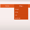
    doubleTapToGo is responsive and touch-friendly dropdown navigation.

    The technique consists of three main parts:

    1. Simple drop-down navigation based on HTML and CSS;
    2. Responsiveness implementation using media queries;
    3. Adoption for touch screen devices with the help of a super tiny jQuery plugin.

    Moving Perspective : jQuery Flexible parralax Slider plugin

    Moving Perspective : jQuery Flexible parralax Slider plugin

    Flexible parralax jquery plugin to create outstanding single perpective and persepective sliders. This is only one perspective script with slider possibility. It is flexible,configurable and easy to use.

    Features:

    • flexible configuration every moving element
    • configurable by html attributes or javascript
    • works on every browser from ie7
    • responsive for mobile devices and all screen resolutions
    • handles touch events
    • can be used as single perspective or as slider
    • can be used many times on one page
    • can be nested ( phone examples )
    • has slide effects: fade, slideUp, slideDown, slideLeft, slideRight
    • uses css3 perspective
    • handles image and video loading
    • contains 3 slider navigation themes
    • has callback function on moving so can be extended

    jQuery Responsive Multi-Level Menu with CSS3

    jQuery Responsive Multi-Level Menu with CSS3

    Today we want to share an experimental drop-down menu with you. The main idea is to save space for menus that have a lot of content and sub-levels. Each sub-level in this menu will be shown in its own context, making the “parent” level disappear. This is done with subtle animations that are defined in separate animation classes. The menu is fluid so that it can be used easily in a responsive layout.

    Bugibba : jQuery 3D transition effects SlideShow

    Bugibba : jQuery 3D transition effects SlideShow

    Bugibba SlideShow easy to use slider with awesome 3D transition effects.

    Features:

    • 2 type menu slideshow responsive.
    • 1 type slideshow full screen
    • Adjustable transition speed.
    • Compatible with all major browsers (IE7-IE8 and above , Chrome, Firefox, Safari and Opera)

    MelonHTML5 – Metro UI in HTML5, CSS3 & jQuery

    MelonHTML5 - Metro UI in HTML5, CSS3 & jQuery

    Metro UI is a flexible and easy to integrate framework to build your one page website in Windows 8 Metro UI. It is fully powered by HTML5, CSS3 and JavaScript with plengy of options for you to configure it to suit your own needs.

    Features:

    • Desktop and Mobile Device (Phone + Tablet) Ready
    • Resonsive UI Design
    • Old IE Support
    • Sliding Button Bar
    • One Page Application
    • Working with Browser Back button
    • Customizable Tiles
    • Smart Page Content Caching
    • Integration with Google Analytics
    • Object oriented JavaScript framework

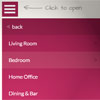
    Flaunt.js : jQuery stylish responsive navigations

    Flaunt.js : jQuery stylish responsive navigations

    Flaunt.js is a jQuery script that allows you to create a responsive, nested navigation out the box. Flaunt was built to overcome responsive design challenges which faced a huge percentage of websites. This challenge was to show nested navigation items on click-demand, without the event taking you through to the page you’ve pressed…