
Today we will show you how to create a simple image zoom out effect with jQuery. The idea is show some images which are zoomed in initially and when hovering over an image it gets zoomed out. This effect could be used in photography websites or image galleries. Our example uses some black and white images to focus on the effect.
Best jQuery Image Hover Effect Plugins & Tutorials with Demo
Build A Greyscale jQuery Image Gallery
Displaying images galleries on your web pages can be very complicated, much like the jQuery modal boxes, today you will learn a very simple way to create a nice looking image gallery in CSS and jQuery.
The gallery has a main image and multiple alternative images which on the hover event will change the main image.
The CSS will be used to setup the look of the gallery and jQuery is used to change the main image with the alternative images.
Thumbnail Proximity Effect with jQuery and CSS3
Today we want to show you how to create a neat thumbnail proximity effect with jQuery. The idea is to scale thumbnails when hovering over them and also scale their neighbouring thumbnails proportionally to their distance. We’ll also make a description appear.
This is based on a request we once got from a reader who asked if the effect on http://porscheeveryday.com/ could be achieved with jQuery. This is our attempt to recreate the basics of that effect.

Flow Slider: Mouse-Controlled jQuery Image Slider

Flow Slider is a jQuery plugin that lets you slide your HTML content as you always dreamed to. Flow Slider allows you to select from a range of transition effects or add your own, change settings, attach events, interact with the slider, and dress it in any design. It works by converting an unordered list into a slider and can be browsed by hovering to the right or left side of it.
Item Blur Effect with CSS3 and jQuery
Today we want to show you how to create a simple blur effect for text-based items. The idea is to have a set of text boxes that will get blurred and scaled down once we hover over them. The item in focus will scale up. This will create some kind of “focus” effect that drwas the attention to the currently hovered item.
We’ll be using CSS3 transitions and some jQuery to apply the respective classes. Since CSS3 transitions are not supported in order browsers, the demo should be best viewed in Safari or Chrome (here we got the smoothest transitions).

Hover and Click Trigger for Circular Elements with jQuery
Applying a :hover pseudo-class to an element is widely known as the classic “hovering” over an element on a web page. A problem that arose with the introduction of the border-radius property is the non-realistic triggering of the hover event when entering the bounding box of the element and not just the actual visible area. This becomes extreme when we create a circle by setting the border-radius of a square to 50% (half of its outer width and height).
Today we want to share one possible solution to the circle hovering problem. We’ll create a plugin that will take care of the ‘mouseenter’, ‘mouseleave’ and ‘click’ events to be triggered only on the circular shape of the element and not its bounding box.
jQuery Page Peel
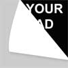
This little jQuery plugin which does exactly what it says on the tin – creates a page peel! This is a little page animation which sits at the top right hand of the screen and when the mouse hovers it the page “peels” down and reveals the content behind it. It could be used to display a popular area or feature of your website but is most commonly known these days to display advertisements. Let’s face it the page peel grabs your attention straight away!
Circle Navigation Effect with CSS3

Today we want to show you how to create a beautiful hover effect for an image navigation using CSS3. The idea is to expand a circular navigation with an arrow and make a bubble with a thumbnail appear. In our example we will be showing the thumbnail of the next and previous slider image on hovering the arrows. The effect is done with CSS3 transitions.


