If you are converting your photoshop psd file to html css and not using css responsive framework then you should seriously consider it.Their are lot of advantages of using css frameworks.A well-built CSS framework or boilerplate can streamline the design process, save huge chunks of development time and ensure your website scales properly on all devices.These frameworks not only makes your website responsive but it also save your development time.Today we are going to show you some popular css framework.
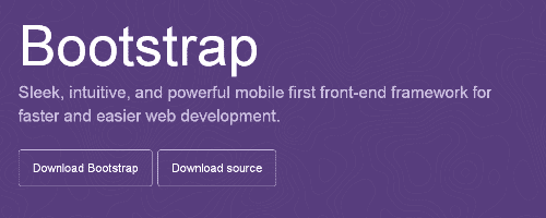
1.Bootstrap
Bootstrap is Sleek, intuitive, and powerful CSS and Javascript front-end framework for faster and easier web development.
2.Foundation 3
An advanced responsive front-end framework. Foundation 3 is built with Sass, a powerful CSS preprocessor, which allows us to much more quickly develop Foundation itself — and gives you new tools to quickly customize and build on top of Foundation.

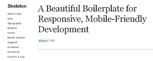
3.Skeleton
A Beautiful Boilerplate for Responsive, Mobile-Friendly Development. Skeleton is a small collection of CSS files that can help you rapidly develop sites that look beautiful at any size, be it a 17″ laptop screen or an iPhone.
4.Gumby
Gumby Framework is a responsive 960 grid CSS framework which includes multiple types of grids with different column variations which enables you to be flexible throughout an entire project’s lifecycle.

5.Golden Grid System
A folding grid for responsive design.

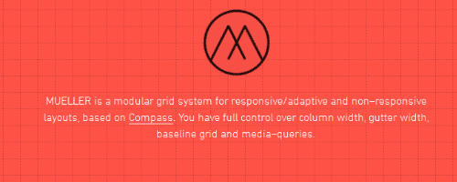
6.Mueller Grid System
MUELLER is a modular grid system for responsive/adaptive and non–responsive layouts, based on Compass. You have full control over column width, gutter width, baseline grid and media–queries.
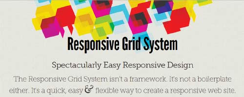
7.Responsive Grid System, by Graham Miller
Spectacularly Easy Responsive Design. Inspired by Ethan Marcotte’s responsive web design, this site was set up in the spirit of giving something back. I found something that works for me, and I want to share it.
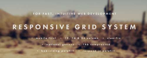
8. Responsive Grid System, by Denis LeBlanc
Simple CSS framework for fast, intuitive development of responsive websites. Built using the ‘Mobile First’ approach, ‘clearfix’ for clearing floats, box-sizing: border-box for adding additional padding to elements, and weighs less then 1kb compressed. Responsive design isn’t hard, you’ve just never
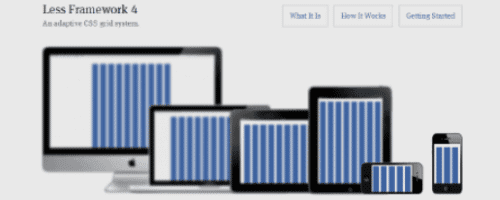
9. Less Framework 4
Less Framework is a CSS grid system for designing adaptive websites. It contains 4 layouts and 3 sets of typography presets, all based on a single grid.
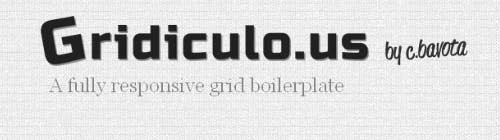
10.Gridiculo.us
Gridiculous was created after I tried out a bunch of different responsive grids and realized that none of them offered all of the features I required.
11.Columnal
The Columnal CSS grid system is a “remix” of a couple others with some custom code thrown in. The elastic grid system is borrowed from cssgrid.net, while some code inspiration (and the idea for subcolumns) are taken from 960.gs.

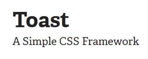
12.Toast
Toast is a CSS framework as simple as it can be, but no simpler. A twelve column responsive grid makes layouts a breeze, and with box-sizing you can add padding and borders to the grid, without breaking a single thing.
13.Ingrid
Ingrid is a lightweight and fluid CSS layout system, whose main goal is to reduce the use of classes on individual units. Making it feel a bit less obtrusive and bit more fun to reflow for responsive layouts.

14.960 Grid System
The 960 Grid System is an effort to streamline web development workflow by providing commonly used dimensions, based on a width of 960 pixels. There are two variants: 12 and 16 columns, which can be used separately or in tandem.
15.Base
Super Simple Responsive Framework built to work on mobile devices, tablets, netbooks and desktop computers
16.Susy
Responsive grids for Compass. Susy is based on Natalie Downe’s CSS Systems, made possible by Sass, and made easy with Compass. You can use it anywhere, from static sites to Django, Rails, WordPress and more. It even comes packaged as part of Middleman, to make your life easy.
17.YAML 4
A modular CSS framework for truly flexible, accessible and responsive websites. YAML is tested and supported in major modern browsers like Chrome, Firefox, Opera, Safari and Internet Explorer.

18.Tuktuk
Not trying to compete with Bootstrap or Foundation because they play in another league. Just worry about creating responsive and fully extensible sites easily.
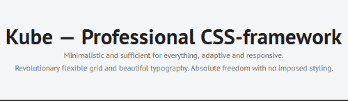
19.Kube
CSS-framework for professional developers. Minimal and enough. Adaptive and responsive. Revolution grid and beautiful typography. No imposed styles and freedom.
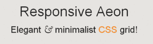
20.ResponsiveAeon
ResponsiveAeon is an elegant & minimalistic css3 grid system framework, now with a responsive grid all based in percentage with mediaqueries, html5 starting point and javascript.
21. Neat
The primary objective of the Neat grid framework is to promote clean semantic HTML markup by using Sass mixins to avoid excess presentional classes and wrapping div elements. Get started with Neat by reading through their docs and studying some examples.

22. Simple Grid
If you’re a minimalist, then Simple Grid is a system to check out as it aims to provide you with the bare-minimum you need for creating a responsive CSS grid layout. Also, 1140px is the base width of Simple Grid, not the more-common 1024px, because the Simple Grid creator believes that we’ve outgrown that convention.

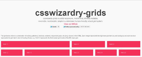
23. csswizardry-grids
This responsive grid system’s approach is to go about designing web layouts mobile first. Similar to the Neat philosophy discussed earlier, if you’re concerned about populating your markup with an overabundance of presentational CSS classes, then you have the option to uses Sass’s @extend feature with csswizardry-grids.This responsive grid system’s approach is to go about designing web layouts mobile first. Similar to the Neat philosophy discussed earlier, if you’re concerned about populating your markup with an overabundance of presentational CSS classes, then you have the option to uses Sass’s @extend feature with csswizardry-grids.
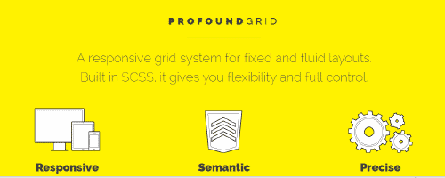
24.Profound Grid
One of Profound Grid’s unique features is that it’s precise in rendering your fluid grid layouts in all the browsers it supports. How does this responsive CSS grid system achieve such a feat? By using negative margins to calculate column dimensions.
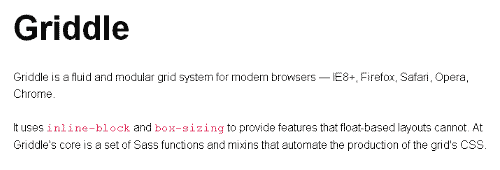
25.Griddle
Griddle is for web designers and websites that put the focus towards modern browsers. This CSS grid system is generated using Sass functions and mixins. It leverages the powers of CSS inline-block and box-sizing properties, which gives your layouts some new abilities that traditional float-based layouts can’t provide you.
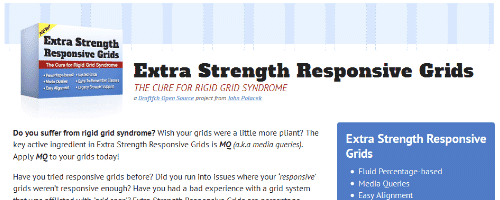
26.Extra Strength Responsive Grids
If you feel that other CSS grid systems are too constraining, if your priority is utmost control over how your responsive layout adapts to the user’s viewing screen, if you care about well-named CSS classes in your markup, you absolutely need to look at Extra Strength Responsive Grids.
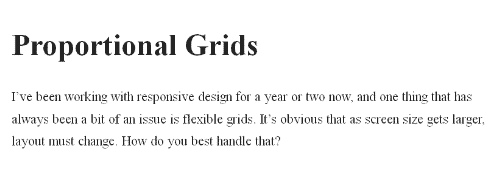
27.Proportional Grids
This CSS grid solution solves the problem that often arises when we rescale our layouts; disproportionate sizes of gutters between different viewing situations. Proportional Grids allows you to use fixed units of measurement for your gutters, while still being able to have fluid columns.
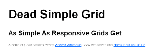
28.Dead Simple Grid
This CSS grid is a lightweight at only 250 bytes. If you just want an uncomplicated responsive grid and nothing more, and if you care a lot about front-end web performance, this tiny grid framework, which only has two CSS classes, is the ticket to your needs.
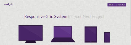
29.rwdgrid
If you’re familiar and comfortable with the most popular grid system out there, 960 Grid System, then rwdgrid — a responsive CSS grid that uses 960 Grid System’s syntax and philosophies — is worth a peak.
30. CSS Smart Grid
CSS Smart Grid builds upon the 960 Grid System by using a mobile first, responsive approach to grid layouts. Oh, and it’s only 1.2KB.

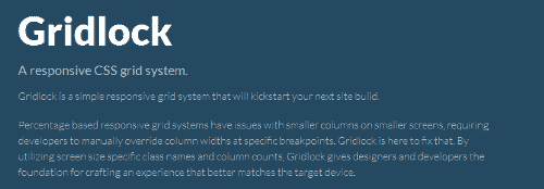
31.Gridlock
Gridlock illustrates a truly mobile first approach to web design by reversing the typical responsive web design media query logic — it doesn’t apply “desktop version” CSS properties to your HTML elements unless they’re needed, thereby possibly improving rendering speed a tad bit on mobile browsers (because the browser doesn’t need to overwrite any style rules aimed at desktop screens).
32.Unsemantic
Unsemantic is a fluid grid system that is the successor to the 960 Grid System. It works in a similar way, but instead of being a set number of columns, it’s entirely based on percentages.

Hi,
Great Collection! I will try it out in my daily tasks!
Dan
Hi,
thank for the big collection!
You should also mention the http://www.initializr.com Project from Jonathan Varrecchia!
@verekia on twitter