Smart Responsive Menu is powerful dropdown menu solution that will work with mobile devices and different screen sizes. Menu relies on CSS media queries to modify menu display for different resolutions. By default, plugin changes paddings and font sizes for screen resolution higher than 480px. For less than 480px, menu changes from horizontal navigation into vertical and gets hidden behind the menu item.
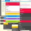
Styling Effects:
- Gradient: with three different gradient styles
- Rounded: with one class for the rounded display
- Box Shadow: with one class for the shadow
- Text Shadow: with two classes for different shadows
- Transitions: with five different transition effects
- Menu Links: with three types of characters and arrows