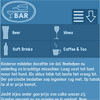
This tutorial aims to provide step by step instructions to enable you to create a responsive navigation menu that adapts to varying screen sizes, with the help of CSS media queries.
I adopted the Mobile First approach to designing the menu. In essence, this approach adopts a strategy of designing for mobile devices first, then working your way up to larger ones, such as desktop monitors. The base design is developed for the popular dimensions of mobile devices – 320 x 480. I then utilised media queries, primarily for scaling up to larger screen sizes, but also as an effective tool for enhancing the design.
